5 Tips For Creating a Cohesive Instagram Feed
Have you ever been on someone’s instagram profile and was just in awe at how beautifully coordinated it was? It was truly a feast for your eyes? Have you ever wished that you could create a similar effect that leaves your followers amazed and coming back for more? Not to mention, attract new followers to your profile? Well, have no fear. I’m here to give you some tips to make that feed of yours go from “meh” to top notch.
It’s no secret that visually appealing designs draw the customer in and if done right can spark engagement and conversation. This also holds true for the graphics you use on your social media profiles and website and specifically because of Instagram’s layout, it becomes an excellent way of showcasing what you have to offer. Having a cohesive profile adds that special professional touch to your brand and shows that you put thought and effort into what you create. There are a few ways you can go about creating a cohesive instagram feed and below I’ve listed five primary tips on how you can do just that.
1. Get Inspired
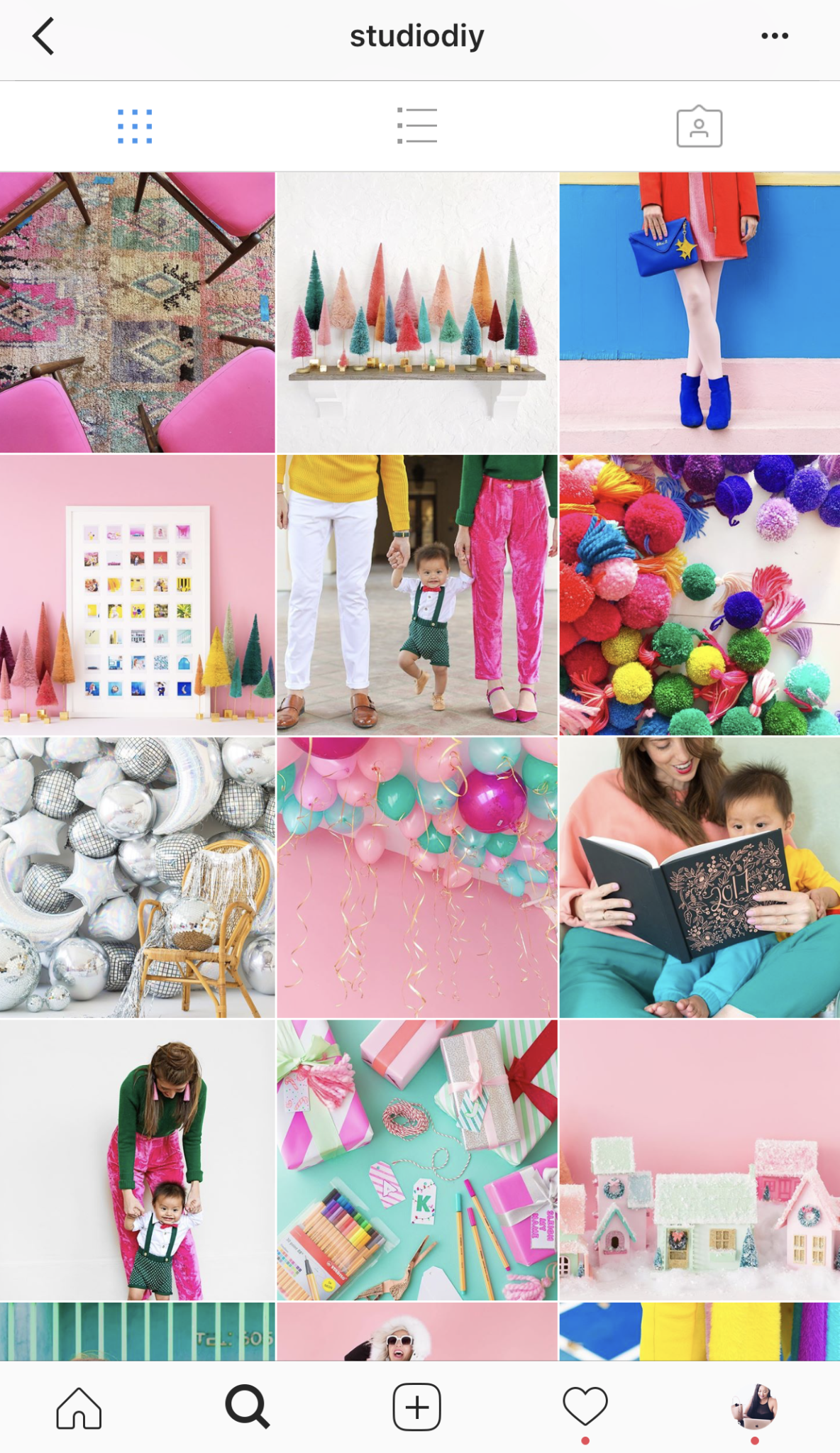
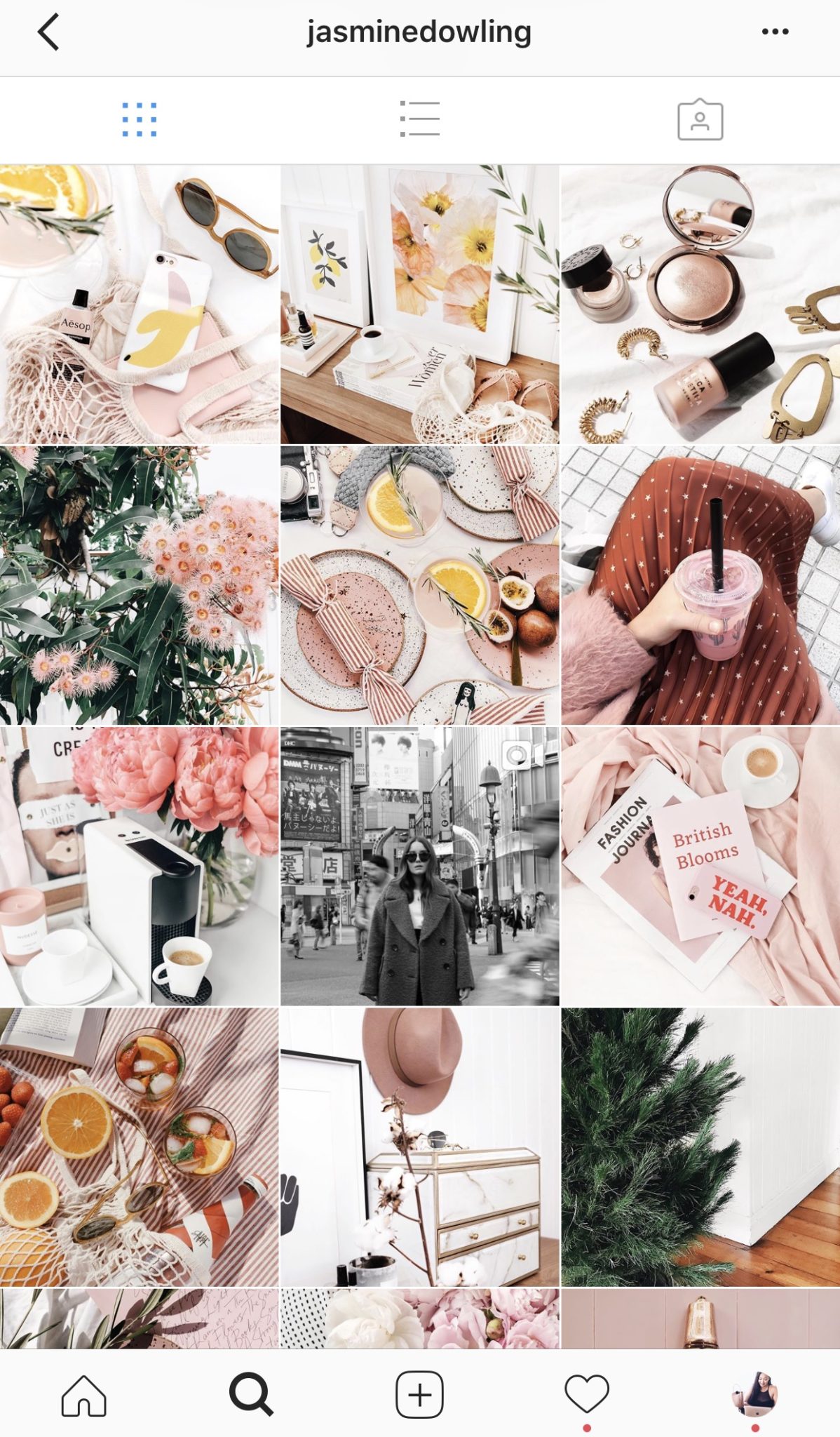
At the beginning of this year, I changed my entire branding colours. Yup, all of them and decided I wanted all of my social media profiles, including Instagram, to have the same feel. So how did I go about deciding what I wanted my profile to look like? I scoured Instagram itself for inspiration. There are so many profiles out there who are doing a fantastic job of making their feeds visually appealing so it’s easy to get inspired and excited about creating your own look. One feed in particular that I love is, @studiodiy. The bright colours make me want to sit and look at that feed forever – it’s so fun and festive. I also drew inspiration from @jasminedowling – I was never in love with the colour pink until I viewed her feed.
2. Choose a colour palette.
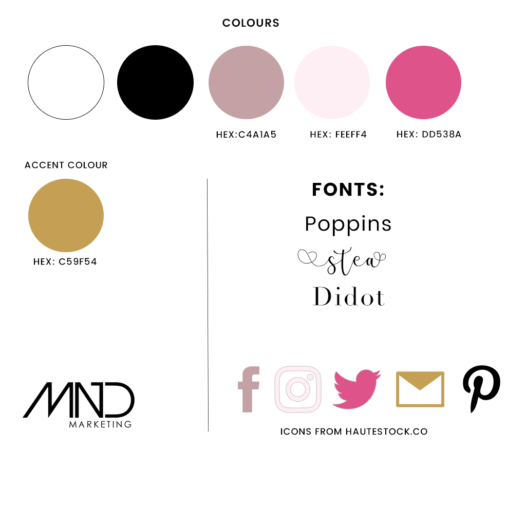
In order to make your instagram feed as cohesive as it can be, sticking to a colour palette is a must. Whether you incorporate white space, pastels, or bright pops of colour, the colours you choose should play well together. Below is the colour palette I created at the beginning of this year and have stuck to for the whole of 2017 across my website and all my social media profiles. Sticking to a colour palette can strengthen your brand and make it more recognisable throughout the social landscape. I created this palette in photoshop but this could easily be done in Canva as well. Disclaimer: I’m not a graphic designer, I just chose colours I thought would represent my brand well and appeal to the audience I was looking to attract.
3. Use a Consistent Photo Editing Style
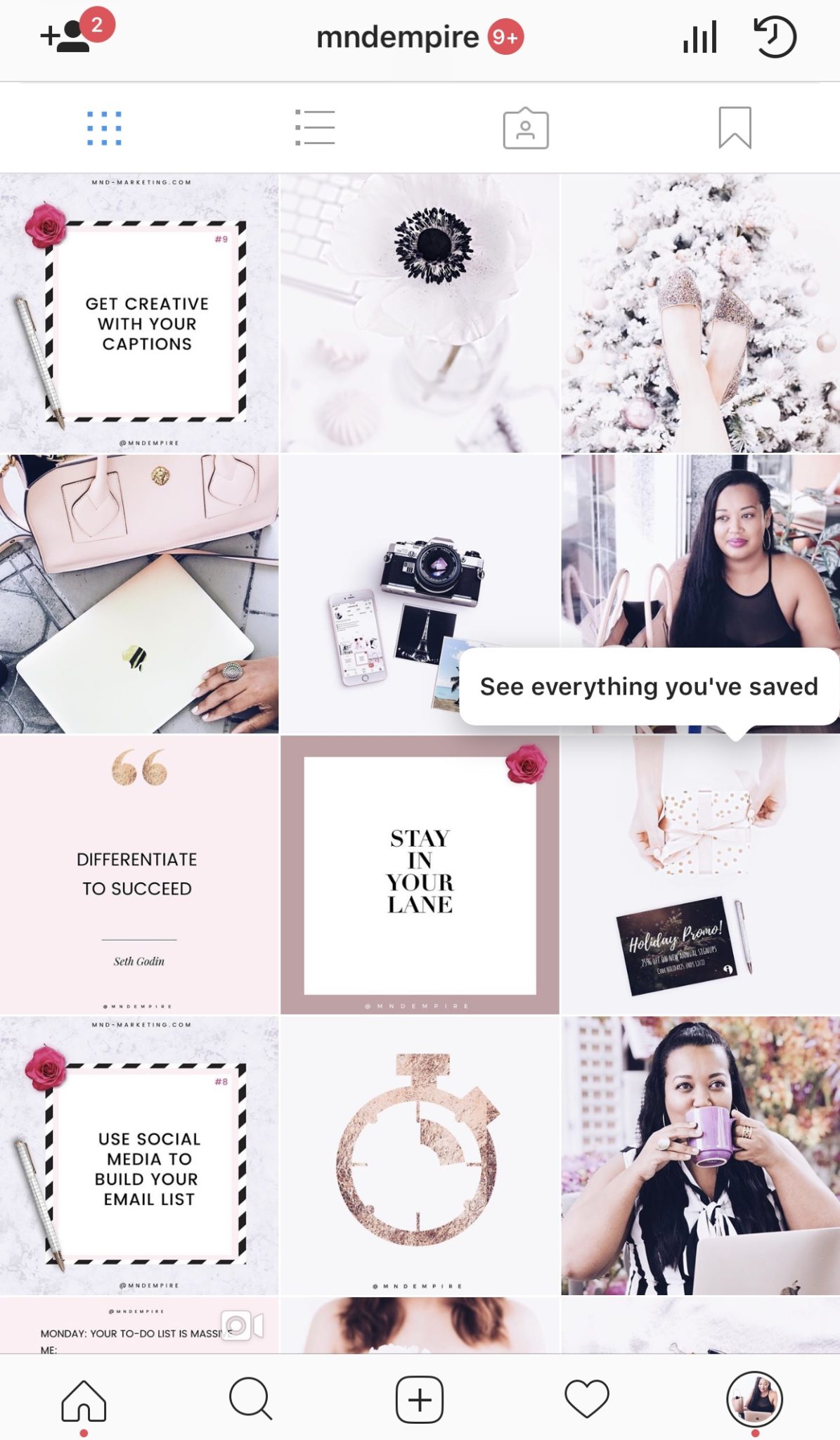
Even though I had chosen a colour palette, I was still editing my photos however I felt like. I know, not the best move. So to combat this I found a distinct editing style and that brought everything together. If you’re skilled you can use Lightroom to edit your photos or if you’re always on the go like I am, VSCO and A Color Story will be your lifesavers. As usual, I scoured Instagram and Pinterest for editing actions that I could use and found the perfect one for VSCO. Both of these apps allow you to save your editing style so that at the click of a button photos can be transformed and branded. This certainly makes the process faster when you’re in a hurry. There are many pre-made editing styles out there, especially for VSCO. I found mine via this Instagram Page which I use on my profile below.
4. Grid Layout? Most Definitely
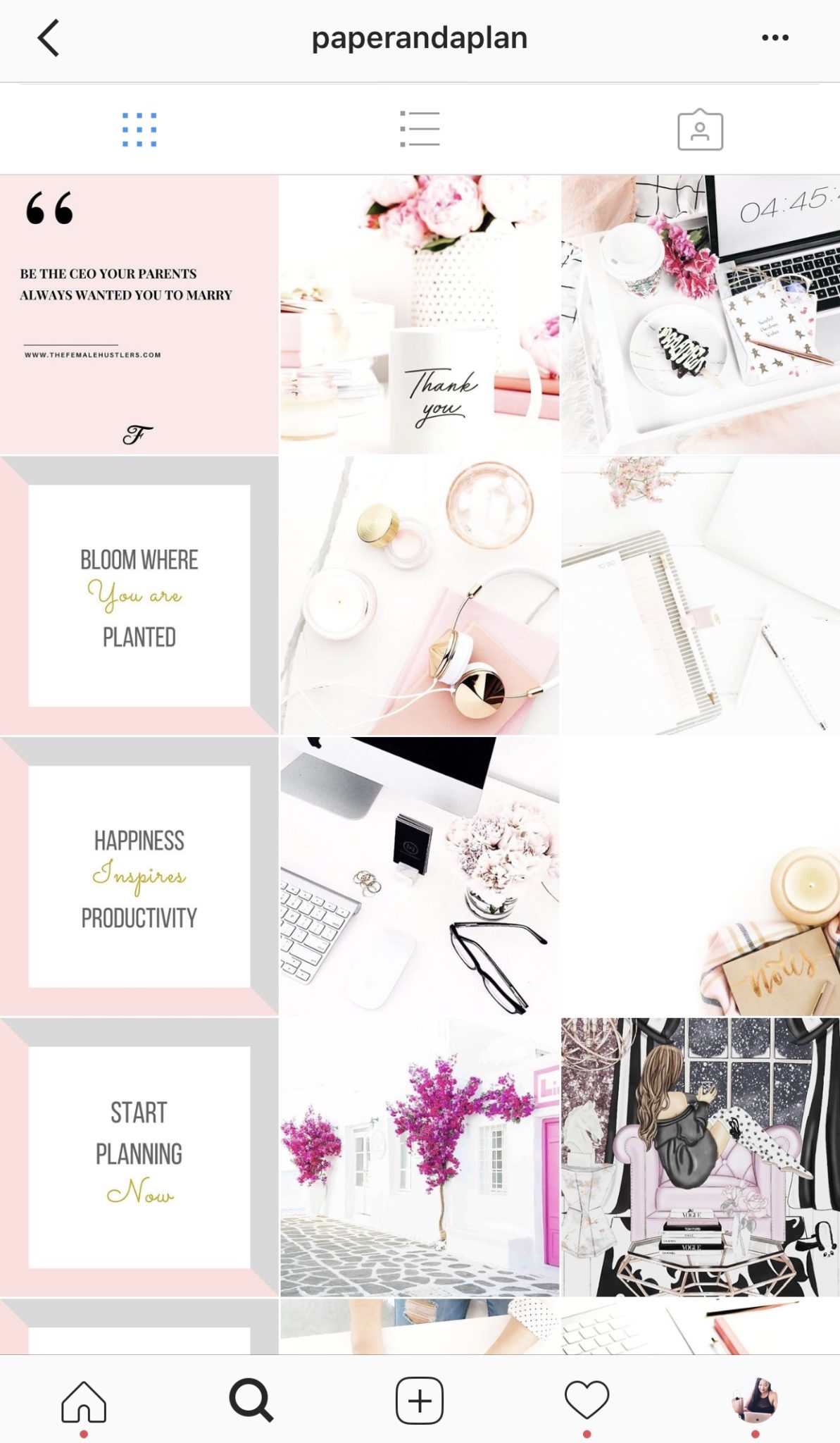
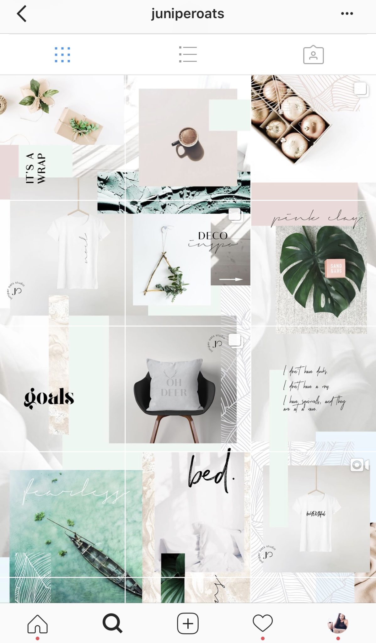
After you’ve spent time deciding how you want your profile to look and have chosen a photo editing style and colour palette, next comes looking at the grid itself. If you’re posting quotes to your profile along with photos, you can alternate between the two to create a checkerboard effect. You could also post in columns like @paperandaplan‘s Instagram profile OR use a puzzle layout like @juniperoats below. The options are endless and totally up to you on how creative you want to be.
5. Plan Your Way to Cohesion
Last but certainly not least, is using a planning app for your instagram. This takes the guess work out of imagining what your feed would look like with a certain photo or a certain layout. I personally love Planoly and it has helped me create the kind of feed I can be proud of but there are many other planning apps out there that can suit your needs – such as Preview and Later.
While creating a beautiful feed is sure to make an impression with your audience, remember the heart of the matter lies with the type of content you choose to post. Creating quality content that serves your audience and solves their problems should be your main focus but looking good while doing it, always helps. If you’d like some inspiration on content ideas for your instagram feed, be sure to check out my last blog post – 9 Content Ideas For An Engaging Instagram Feed.
With love from Barbados,
![]()
If you liked this post, don’t forget to share!


